Color is powerful. It has the power to persuade, evoke, express and communicate. It can also be an effective tool to communicate with your users. However, color is subjective and must be used in the right context. The context of our relationship with color is a complex one, rooted in biological, cultural and personal associations. So, as powerful as color is, can it affect your mood?
“If one says ‘Red’ – the name of color – and there are fifty people listening, it can be expected that there will be fifty reds in their minds. And one can be sure that all these reds will be very different.”
— Josef Albers
Can Color Affect Your Mood?
The answer is yes and no. Unfortunately, there is very little research on how the brain actually responds to color. Most color psychology “facts” are not grounded in science.
As mentioned earlier, we respond to color in three different ways. The first is our biological response. We do know a bit about how we respond biologically to red objects; They can inspire fear and sexual desire. We also know some things about how we respond biologically to blue light; it can help with everything from seasonal affective disorder (SAD), to issues with our internal clocks, to problems with concentration.
The second is our cultural response. For example, in the West, blue is far and away the favorite color and yellow the least-favorite color, whereas if you go to the East, yellow climbs to the top of the charts. These differences have to do with the cultural associations with various colors.
The third is our personal associations with color. Did you go to prison and have to live in a pink cell? Then pink may be a real turnoff to you. Did you grow up with a pink bedroom in a loving, supportive household? Then you may gravitate towards pink.

© Jeff Haynes and Getty, Fair-use

© Kathryn Hawkes and House of Hawkes, Fair-use
Don’t be fooled by the claims that peach whets the appetite, or pink is calming, or yellow uplifts. Maybe these are true for some people whose personal, cultural and biological responses line up to support these claims, but test a different group of people across the globe (or even within the same family) and you may find completely different results. Color surely can affect mood — put a group of people in a room with fluorescent yellow walls, floor and ceiling… and they're certain to feel something — but whether everyone in the room feels the same thing for the same reasons is at this point very hard to prove.
Now that you understand how colors can affect your mood, let’s get into specific colors. Please remember, context is the key. Our relationship with color is a complex one, rooted in biological, cultural and personal associations. Do your research, be sensitive to your user and take an interest in cultural values to create good design. And never assume that the color you like will also be liked by someone else.
“Color helps us navigate quickly, easily, and often with joy.”
— Arielle Eckstut
In this lesson, you’ll learn about Color Symbolism from Arielle and Joann Eckstut, co-authors of “Secret Language of Color: Science, Nature, History, Culture, Beauty of Red, Orange, Yellow, Green, Blue, & Violet.'' We’ll explore the meaning of color and learn about the importance of context.
Red
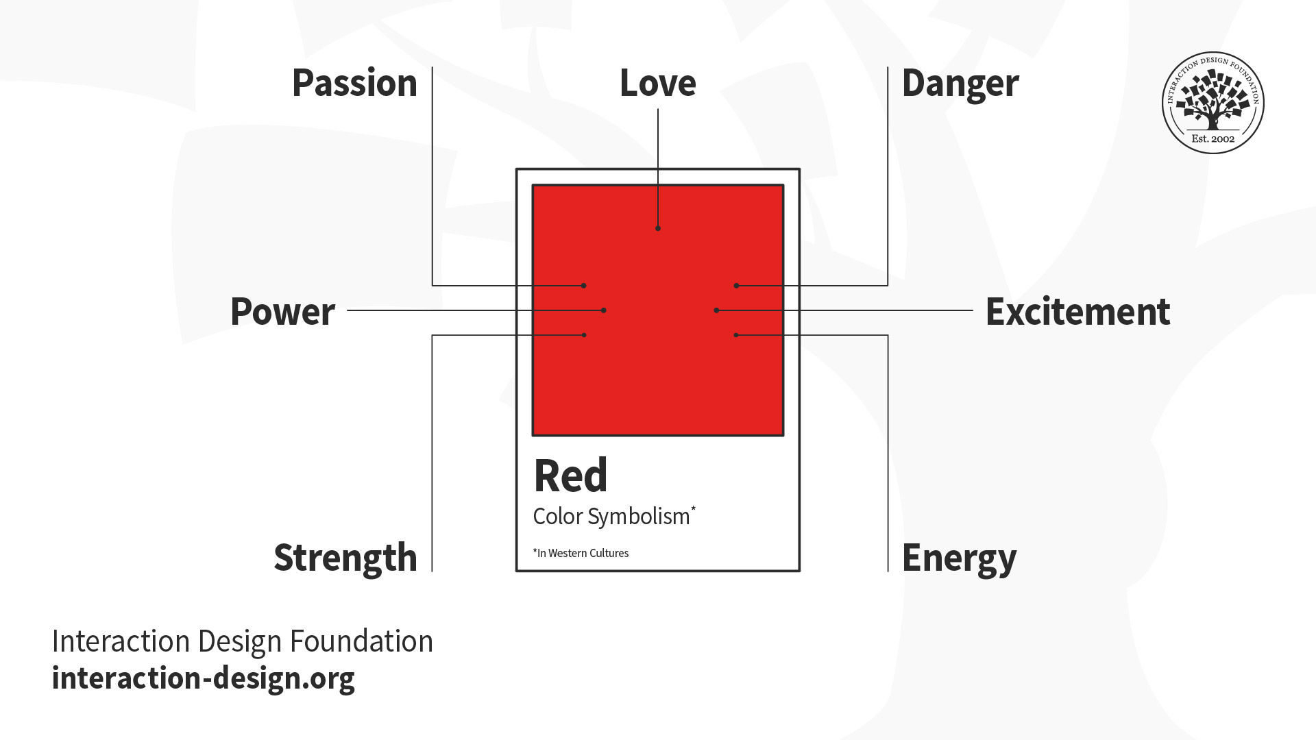
© Daniel Skrok and Interaction Design Foundation, CC BY-SA 3.0
The flashiest and sultriest of hues, red is a color that has fanned the flames of revolutions. It’s a color that groups as diverse as Satanists, Communists and American conservatives have all claimed as their own. Red can be used equally to express love or hate and may signal sin, fertility, courage, guilt or good luck, depending on your longitude and latitude. Whether you “see red” symbolically, in its angrier turn of phrase, or follow its practical injunctions as a law-abiding citizen, it will stop you in your tracks. Just be careful not to get lured into the red-light district by a red herring and emerge red-faced, branded with a scarlet letter.
Red, particularly in Western Cultures, can symbolize any of these:
Love
Passion
Strength
Power
Danger
Excitement
Energy
Practical Tip: In the East, red is regarded as the color of happiness, wellbeing and good fortune, so always consider the context.
Orange
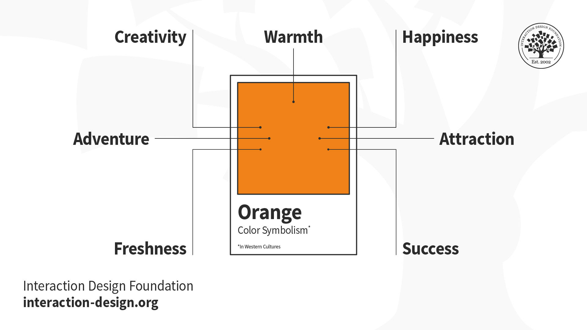
© Daniel Skrok and Interaction Design Foundation, CC BY-SA 3.0
For millennia, orange was a color without an identity. In many languages, it’s one of the very last, if not the last, color named in the rainbow. Many native cultures still see no need to give orange its own label. Of course, orange has always existed and been plentiful, be it in the form of blooms, fruits, vegetables, animals, or the sky as the sun sets. Through pigments like saffron, it has long colored clothes and canvases. It has been used to symbolize nationhood, religious identity and athletic applications. Yet it doesn’t come close to its neighbor, red, in terms of its place in the world. This may have to do with the nature of orange as a visible hue: When pale, it is usually identified as yellow. When dark, it is usually identified as brown. There is a narrow band in which orange can show off its true self, but in that narrow band it shines.
Orange, particularly in Western Cultures, can symbolize any of these:
Warmth
Adventure
Freshness
Happiness
Attraction
Success
Practical Tip: Because orange is associated with happiness and creativity it is well suited to youthful, energetic brands and best avoided for luxury, traditional or serious products.
Yellow
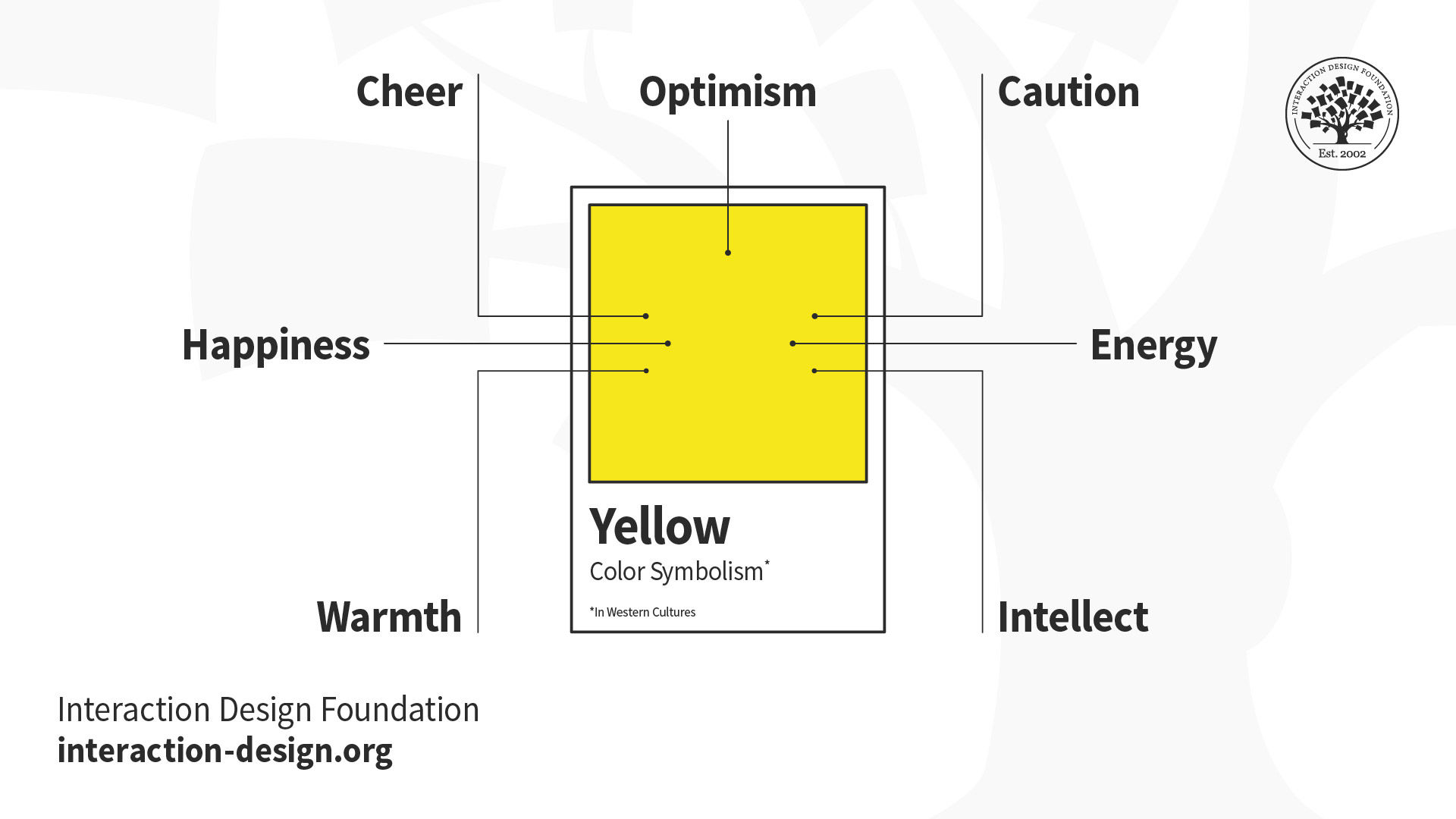
© Daniel Skrok and Interaction Design Foundation, CC BY-SA 3.0
You spot a taxi a few blocks away. You hail it and get in. The cabbie speeds off before you’ve even closed the door. He’s going way too fast, but he slows down as he sees a road sign indicating a dangerous curve ahead. He brakes again for a forklift in front of him. As he continues to navigate, you pull out a contract with a Post-it note tagging the page that requires your signature. You flip to that page, and a highlighter shows you exactly where to sign. Each of these items that catches your and the cabbie’s eye is yellow. Yellow’s luminescence has also dazzled emperors, painted millions of pencils and cautioned us to slow down, and gotten our attention.
Yellow, particularly in Western cultures, can symbolize any of these:
Optimism
Cheer
Happiness
Warmth
Caution
Energy
Intellect
Practical Tip: Some shades of yellow can look cheap — although this may suit your product image. So, yellow is a great example of when to research consumer reaction to color appropriateness and make sure it is the right color for your product.
Green
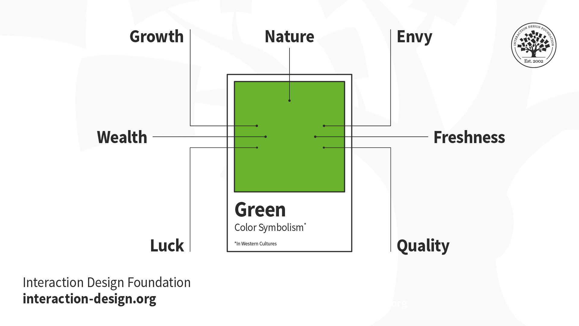
© Daniel Skrok and Interaction Design Foundation, CC BY-SA 3.0
Money. Inexperience. Paradise. Jealousy. A penchant for recycling. A knack for gardening. All of these identify with the color green. And yet, green is so much more fundamental. From the Amazon jungle, to the concrete jungle, it’s nature's greenery that supplies us with the ability to live and breathe. Chlorophyll is the pigment responsible for greenery that surrounds us; although the term sounds scientific, it is simply derived from the Greek words for “green” and “leaf.” And it’s this chlorophyll that produces the oxygen that we need to survive. Green is the essence of life.
Green, particularly in Western cultures, can symbolize any of these:
Nature
Growth
Wealth
Luck
Envy
Freshness
Quality
Practical Tip: Pick your shade of green carefully as brighter, lighter greens indicate growth, vitality and renewal; while darker, richer greens represent prestige, wealth and abundance.
Blue
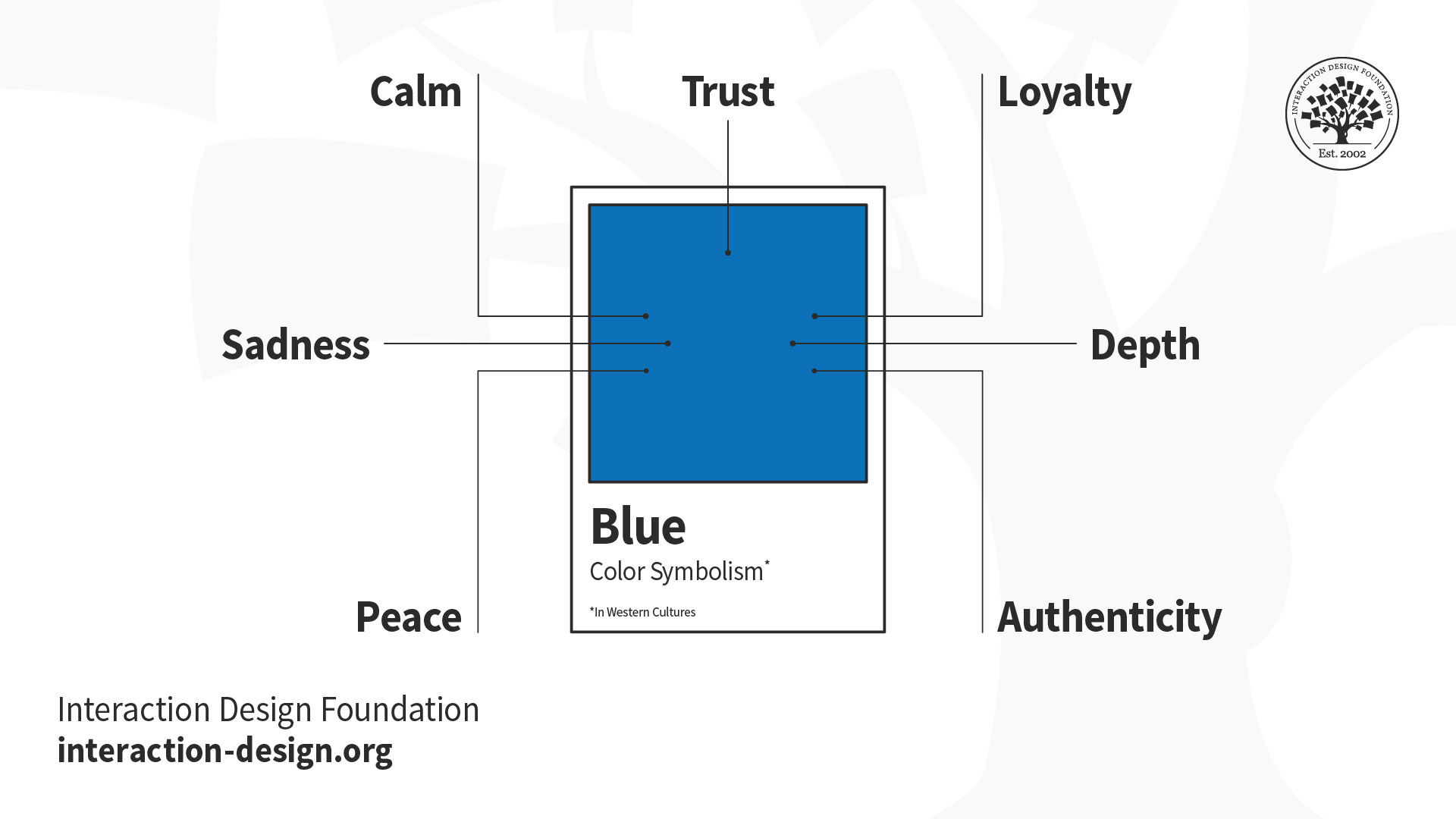
© Daniel Skrok and Interaction Design Foundation, CC BY-SA 3.0
From the nighttime sky to a deep blue sea, the color blue expands our horizons and blankets our dreams. We trust blue (bestowing its authority on our men and women in uniform), depend on blue (granting blue chip stocks their fiscal reliability), see blue as a masculine thing (building up our baby boys and decorating their nurseries), and perceive it as both calming and cooling. On the other hand, we all get the blues at one time or another, and blue can be the moody underside to our otherwise rosy dispositions.
Blue, particularly in Western cultures, can symbolize:
Trust
Calm
Sadness
Peace
Loyalty
Depth
Authenticity
Practical Tip: Blue runs the gamut from corporate and dependable, to calming and tranquil, to feeling down in the dumps. So, choose your shade wisely.
Purple
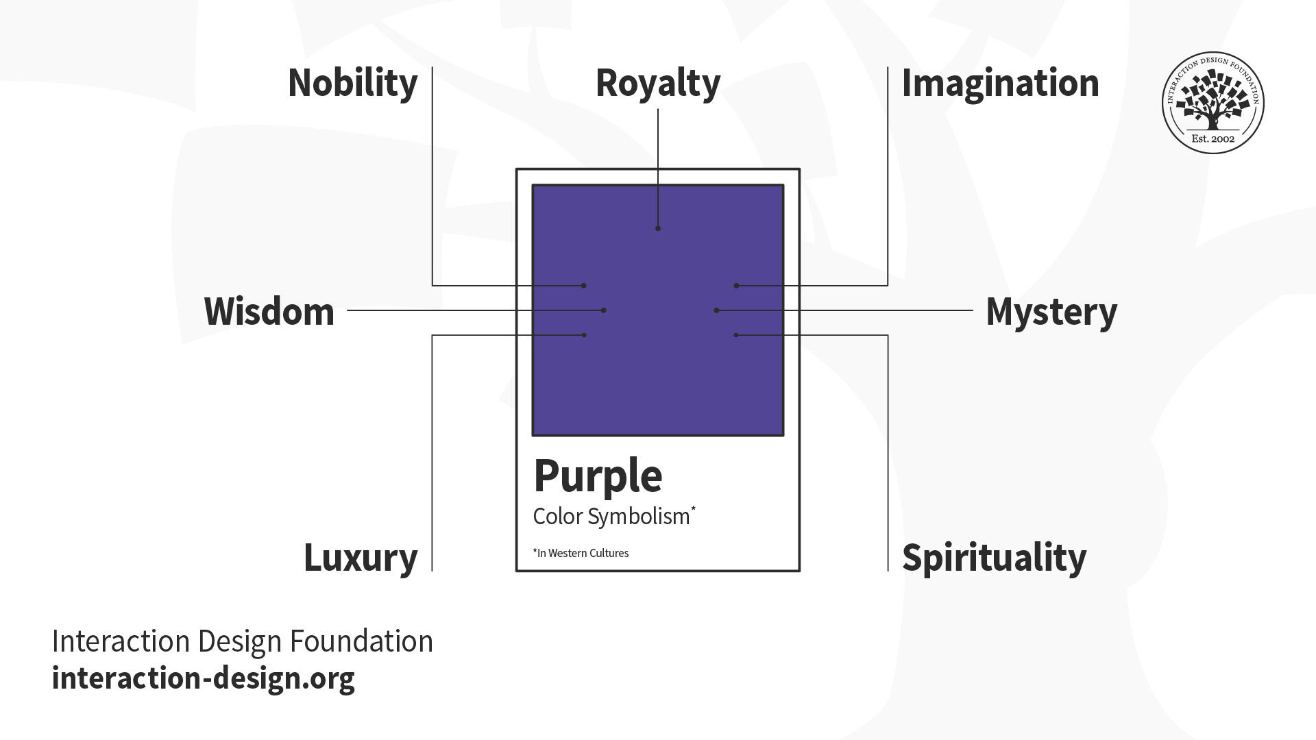
© Daniel Skrok and Interaction Design Foundation, CC BY-SA 3.0
Is there any color more extraordinary, exquisite, exalted, delicious, delectable, desirable, more je ne sais quoi? The color that just seems to fit that so very majestically is, of course, purple.
Purple speaks of high places; it's been associated with royalty for centuries — and for good reason. Nature did not provide an easy means of dying fabric purple. Historically, the production of the dye was one of the most noxious, laborious, time-consuming, and expensive processes around. Only the rich could afford it, and aside from kings’ robes and priests’ stoles, the hue was hard to attain. Those who wore it certainly did so with pomp and circumstance. No shrinking violets in the courts.
Purple, particularly in Western cultures, can symbolize:
Royalty
Nobility
Wisdom
Luxury
Imagination
Mystery
Spirituality
Practical Tip: Purple is best used for targeting a female audience as research suggests women list purple as a top-tier color while it doesn’t even rank for men. Overall, purple is not a common color for branding and, in fact, Cadbury is the only purple brand in the Forbes list of the 100 most valuable brands from 2014.
White
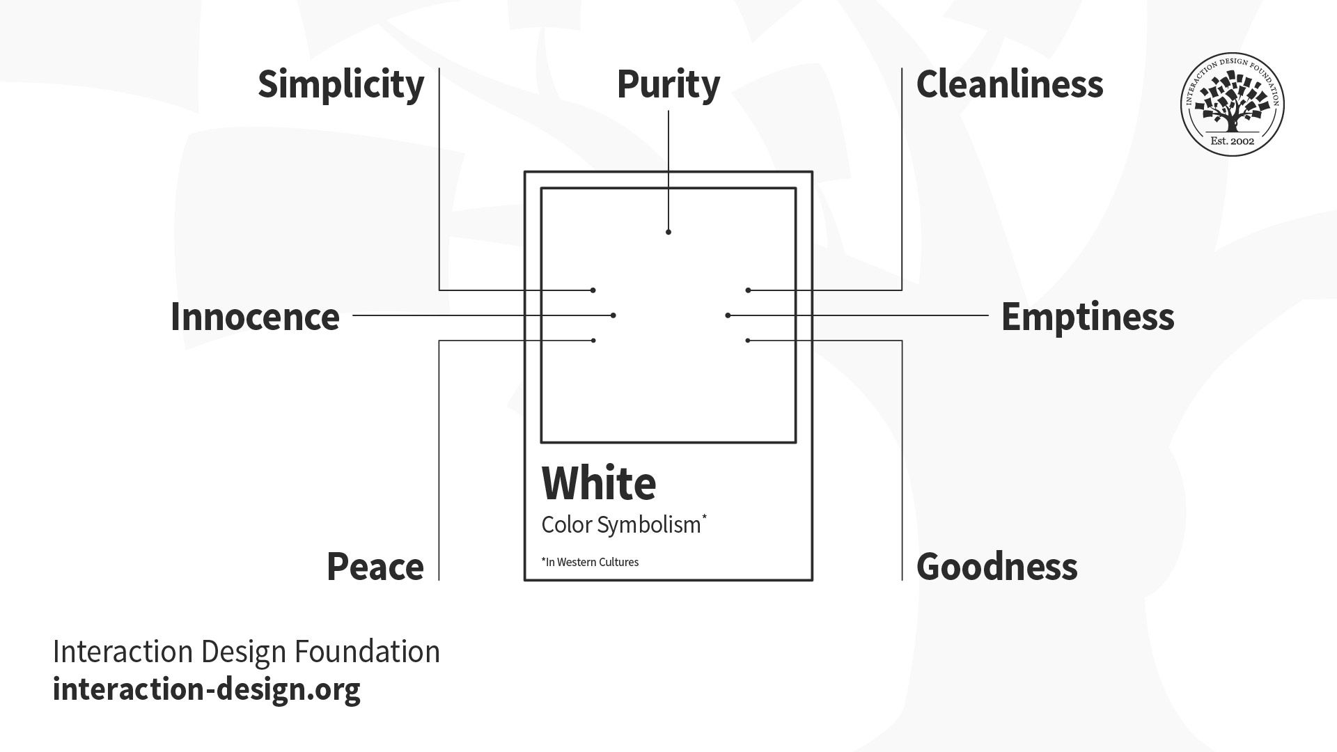
© Daniel Skrok and Interaction Design Foundation, CC BY-SA 3.0
White, an inherently positive color, is associated with purity, simplicity and innocence. It’s the color of snow, the symbol of defeat, and the presence of all colors. You can white knuckle the steering wheel, on your drive home, during a whiteout in winter. In the West, it’s the traditional color worn by brides; in the East, however, it’s worn at funerals. You can surround your home with a white picket fence, but never wear it after Labor Day.
White, particularly in Western cultures, can symbolize any of these:
Purity
Simplicity
Innocence
Peace
Cleanliness
Emptiness
Goodness
Practical Tip: It’s difficult to inject personality into your brand when using white, so make sure your brand is about simplicity, purity and transparency.
Black
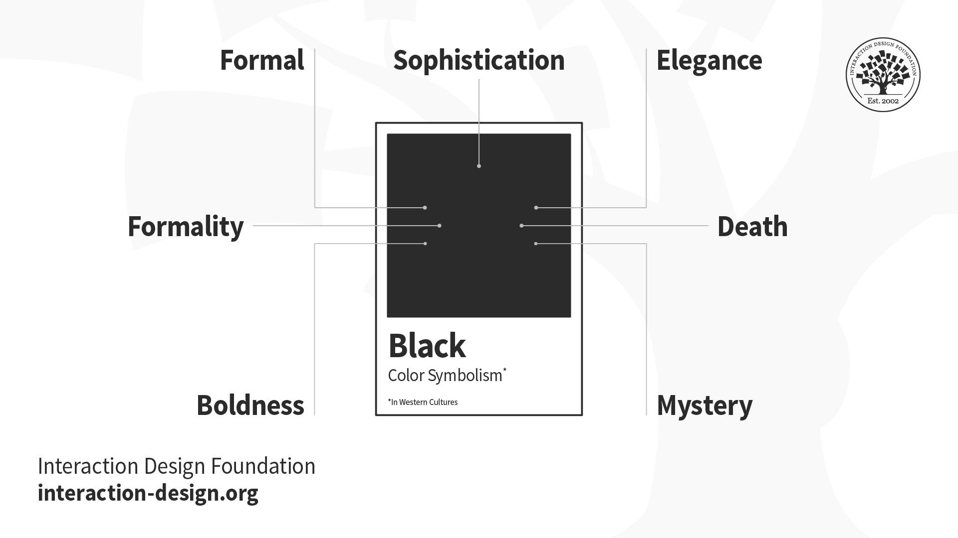
© Daniel Skrok and Interaction Design Foundation, CC BY-SA 3.0
Black, an inherently negative color, is associated with sophistication, sorrow and mystery. This is the color of the night sky, the symbol of death, and the absence of all color. You can get a black eye, or even blackout, while practicing for your black belt in Karate. In the West, it’s the color of mourning and the symbol of grief, but also a slimming color to wear at an elegant black tie event. Your company can celebrate its success of being in the black, but be sure to pay your taxes, or expect a visit from the men in black.
Black, particularly in Western cultures, can symbolize:
Sophistication
Formality
Sorrow
Boldness
Elegance
Death
Mystery
Practical Tip: Contrast a bright color against black; use gold foil for a touch of luxe, or combine it with white for a bold and simple statement. Think about texture and how matte or glossy black might change the message of your brand.
Now that you’ve learned that our relationship with color is a complex one, rooted in biological, cultural, and personal associations — imagine if you had to create a color palette, consisting of 17 colors, that is universally accepted around the world? Take that in for a moment. Let that digest. That challenge is exactly what designer Jakob Trollbäck, founder of Trollbäck + Company and The New Division, created for the Global Goals. Let’s find out how.
Color for Cause: The Global Goals
The story of The Global Goals began in the fall of 2014 with Richard Curtis, film director and founder of Project Everyone, meeting with Jakob Trollbäck, founder of creative studio Trollbäck + Company in New York, to discuss how to best make the agenda famous. Jakob took on the task and transformed the somewhat cumbersome “Sustainable Development Goals” to what they are known as today: “The Global Goals.” Invaluable insights from UN ambassadors and NGOs along the journey pushed Jakob and his team to develop icons that could be universally understood.
© Jakob Trollbäck and Design Forum Finland, Fair-use (Link)
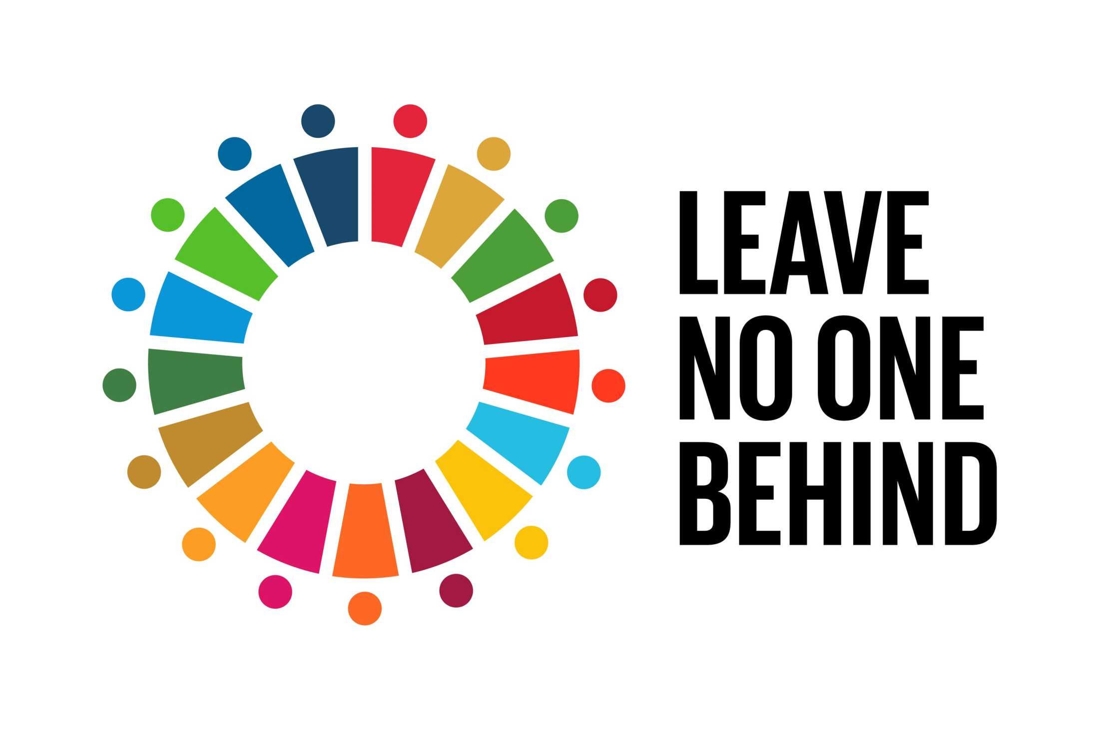
The designs and palette carefully consider cross-cultural relevance and symbolism. The circular logotype for the master brand is an expression of unity and uses the full palette from the icon system. The result is a communication system, signed-off by all 193 member nations. Today, it is universally adopted and used as a hopeful language of change to inspire everyone, everywhere to act.
© Jakob Trollbäck and The Global Goals, Fair-use
It was a creative challenge to find 17 colors that looked good together and to make sure similar colors weren’t next to each other. It was also important to keep certain color associations — for example, making the two goals for Life Below Water and Clean Water and Sanitation blue and the Affordable and Clean Energy goal yellow like the sun. Jakob himself said “…in the end it was like a big color-puzzle” referring to the complexity of the design.
© Jakob Trollbäck and The Global Goals, Fair-use
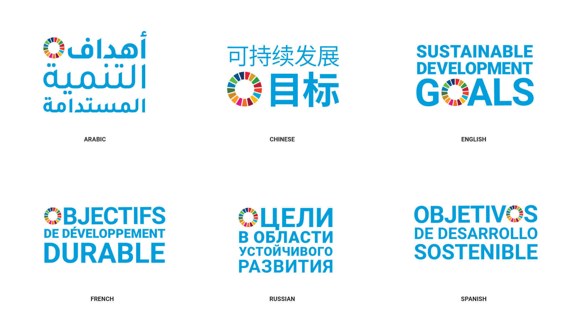
Jakob started the design process by giving the SDGs a more compelling name, transforming the somewhat cumbersome “Sustainable Development Goals” into “The Global Goals.” Below is an exploration of how the logo would read in multiple languages. This exploration shows the careful attention to localization, an important principle in design.
© Jakob Trollbäck and The Global Goals, Fair-use
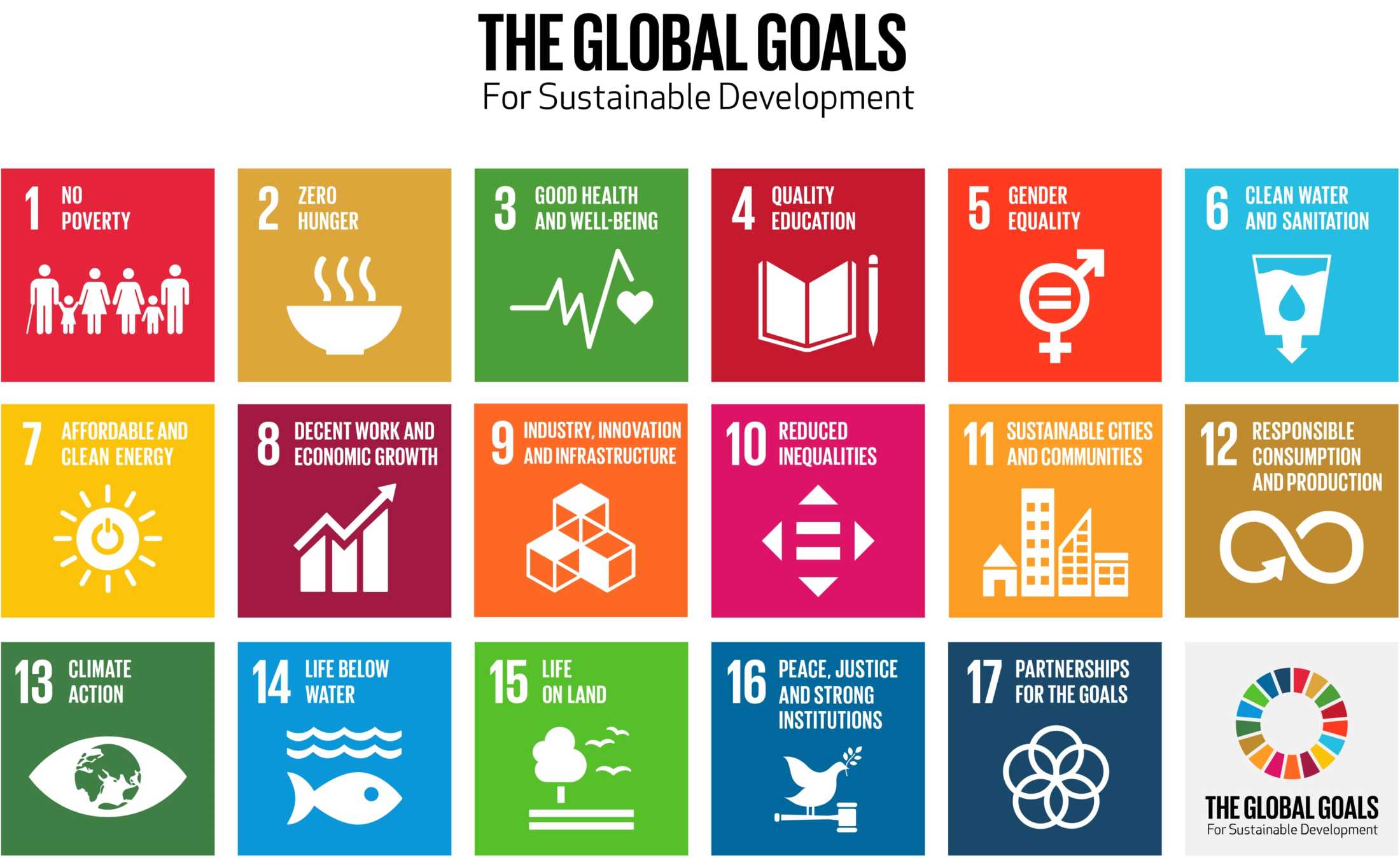
After renaming the logo, Jakob then gave each of the 17 goals a concise name that makes them easy to talk about and remember. Every goal has its own colorful icon with bold typography and bright colors to express the determination and optimism of the effort. He then designed an official logo for the initiative — a bright circle made up of the colors of the 17 individual goals to remind us that they all have to be solved together.

© Jakob Trollbäck and The Global Goals, Fair-use
“Good design is surprising and inevitable.”
— Jakob Trollbäck
According to Jakob, design is very purpose driven and the magic comes when you find a new way to present to users and allow them to find a different way to think. With that concept in mind, Jakob translated the Global Goals into a comprehensive campaign including a website, poster, swatch book and pins.
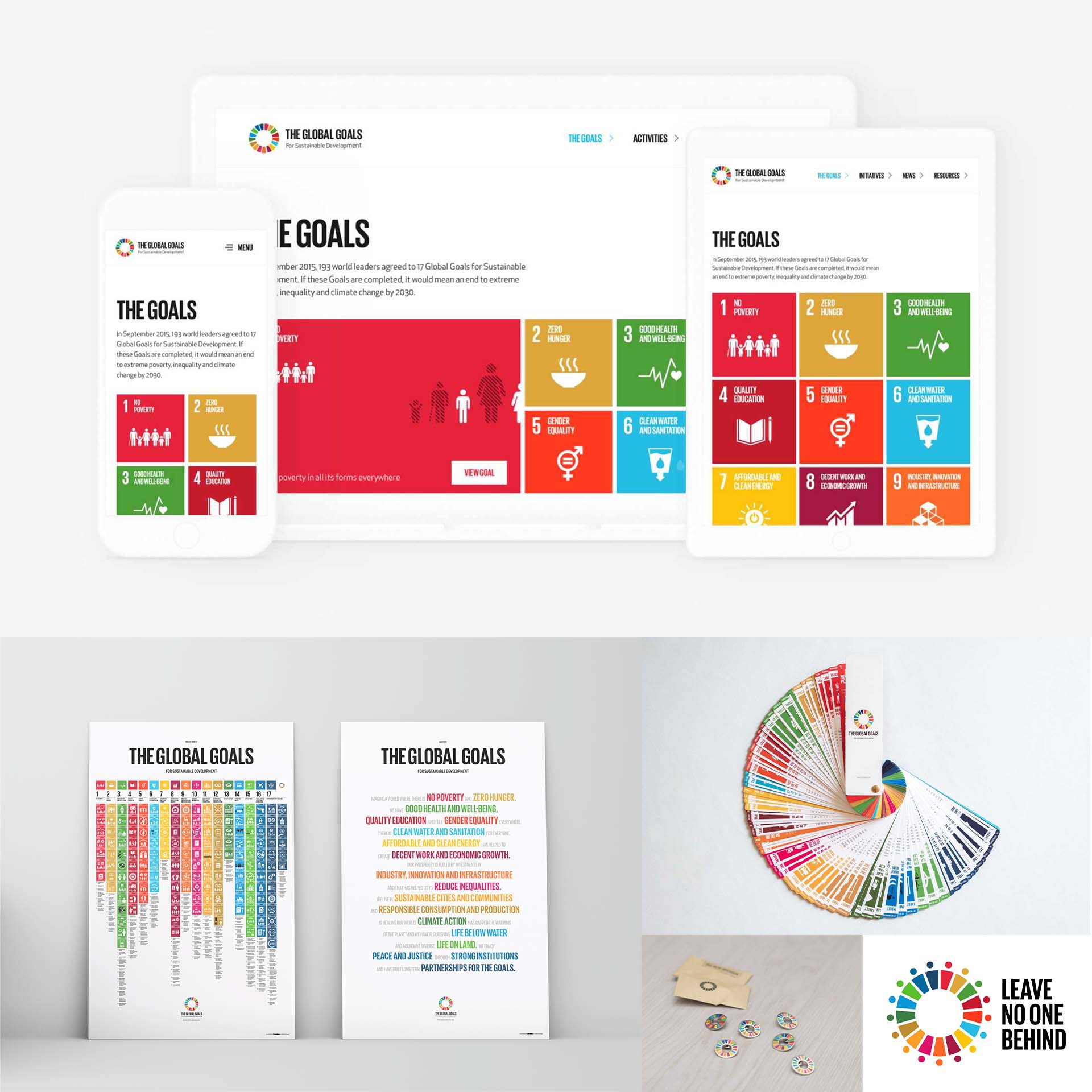
© Jakob Trollbäck and The Global Goals, Fair-use
The Take Away
Color is powerful. It has the power to persuade, evoke, express and communicate. It can also be an effective tool to communicate with your users. However, color is subjective and must be used in the right context.
In this lesson, we learned that the context of our relationship with color is a complex one, rooted in biological, cultural and personal associations. We also learned the difference between warm and cool colors and the cultural symbolism of specific colors in Western cultures.
Red = Love, Passion, Strength, Power, Danger, Excitement, Energy
Orange = Warmth, Creativity, Adventure, Freshness, Happiness, Attraction, Success
Yellow = Optimism, Cheer, Happiness, Warmth, Caution, Energy, Intellect
Green = Nature, Growth, Wealth, Luck, Envy, Freshness, Quality
Blue = Trust, Calm, Sadness, Peace, Loyalty, Depth, Authenticity
Purple = Royalty, Nobility, Wisdom, Luxury, Imagination, Mystery, Spirituality
White = Purity, Simplicity, Innocence, Peace, Cleanliness, Emptiness, Goodness
Black = Sophistication, Formality, Sorrow, Boldness, Elegance, Death, Mystery
Lastly, we learned about The Global Goals and the particular challenges Jakob Trollbäck and his team solved through research, localization and cultural symbolism. Remember, design is very purpose driven and the magic comes when you find a new way to present to users and allow them to find a different way to think.
References and Where to Learn More
Read Joann and Arielle Eckstut’s book “Secret Language of Color: Science, Nature, History, Culture, Beauty of Red, Orange, Yellow, Green, Blue, & Violet to learn more about Color Symbolism.
Read the insightful book What Is Color? 50 Questions and Answers on the Science of Color, by Arielle Eckstut and Joann Eckstut, to learn more about Color.
Watch Design Forum Finland: Communicating Change to hear more from Jakob Trollbäck about his design process.
Learn more about The Global Goals.
Image
© Interaction Design Foundation, CC BY-SA 3.0